Material Design Icons Examples
Material Web Icons [freebie] by Adrian Goia
The set covers six assorted icons that skillfully balance details despite of a relatively small size. Each item reflects the meaning and boasts of a corresponding and vibrant color palette and a beautiful touch of fake 3D dimension.
Web Analytics Material Icon by Khuram Jameel
Web Analytics Material Icon by Khuram Jameel uses simple geometric shapes to outline the idea. Although there is nothing complicated, they look refined. Each glyph is thoroughly crafted and is based on a gorgeous color palette that glues everything together. White space plays important role.
Google Maps & Streetview icon by Jovie Brett
The author demonstrates two revamped versions of popular icons that are animated for better perception. They are made in six-tone coloring, including all the brand colors, and are enriched by subtle shadows.
TaxPro Docs Icons by Qaaim Goodwin
The set radiates of seriousness and formality. The artist has skillfully chosen the primary color palette that counts more than six various tones. The project looks harmonious, consistent and interconnected. A ton of white space adds an open feeling.
Flat Services Icons by Khuram Jameel
Flat Services Icons by Khuram Jameel are bright and original. They break out from the crowd with non-standard background shape and neatly crafted angular feel. Flat style paired with a vibrant material inspired coloring produces an impressive result.
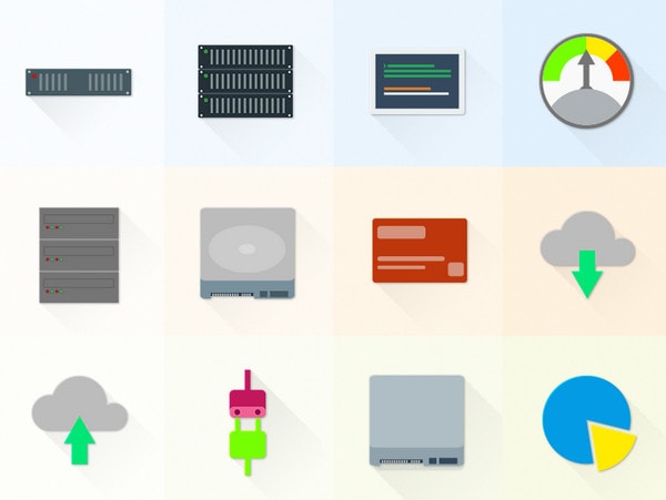
Set Of Material Design Hosting/Server Icons by Oxygenna
Set Of Material Design Hosting/Server Icons by Oxygenna looks less engaging than the previous example due to pastel coloring and more schematic outward. Nevertheless, they still get across the message and set up a businesslike atmosphere.
Icons by Diego Barrionuevo
Icons by Diego Barrionuevo are bright, vector and smooth. However, if you take a closer look, you won’t see any thorough detalization, since the author is managed to embrace minimalism and create a splendid set of glyphs. They will naturally excel from the content flow and direct the attention to the required areas.
Angular Material Icons by Merissa Acosta
Angular Material Icons by Merissa Acosta look a bit gloomy and darkly but still eye-catching and engaging. The designer demonstrates a fresh solution of utilizing material design principles by opting for a slightly dull color scheme instead of accustomed vibrant.
Icons Responsive Material Design Palette by Ramy Wafaa
Icons Responsive Material Design Palette by Ramy Wafaa is bursting with charisma and positive mood. Each icon is charged with a personality and fragile human touch. The harmonious color palette gives the project a marvelous appeal, while flat style helps to avoid messy appearance.
Material Design Icon Template – Freebie PSD
If you are eager to jump into crafting such kind of graphics, then you should download this small yet useful freebie. The template was created as a wireframe prototype that guides during the process. It is available in PSD.
Alcatel Launcher App Icons by Denys Nevozhai
Alcatel Launcher App Icons by Denys Nevozhai combines eight colors in a clever way to create a set that looks natural and bold. There are no shadows or angular appeal; everything is flat and straightforward. Each icon is an accurate reflection of a function.
Isometric Material Icons vol 3 – Charts by Oxygenna
The material design does not always mean something flat; you can create 3D graphics according to its principles like Isometric Material Icons vol 3. The author implements rules of isometric view to convert plane graphs into original and cool 3D components. The primary coloring is based on shades of gray and warm orange tones.
1,000 Flat And Material Design Avatars
1,000 Flat And Material Design Avatars by iconshock has a strong angular vibe that makes each item to protrude a bit forward. Neat and smooth five o’clock shadow strengthens the effect. Each glyph expresses the personality that thanks to bright coloring oozes charm. (Note, this is a premium package; however, the team offers a free set of 150 items.)
Material Inspired Icons Master Set by Jurre Houtkamp
The artist is managed to inject a new life into traditional flat style icons by using vibrant color palette, fake shadows and a considerable amount of white space. Each glyph illustrates the point, has a rhythm and looks a bit funky.
Vegetables and Fruit Set Collection by Samira
Vegetables and fruit set collection by Samira is marked by a gorgeous soft pastel coloring full of gold, earthy and blue shades. Solid shapes go well with monotone backdrops.
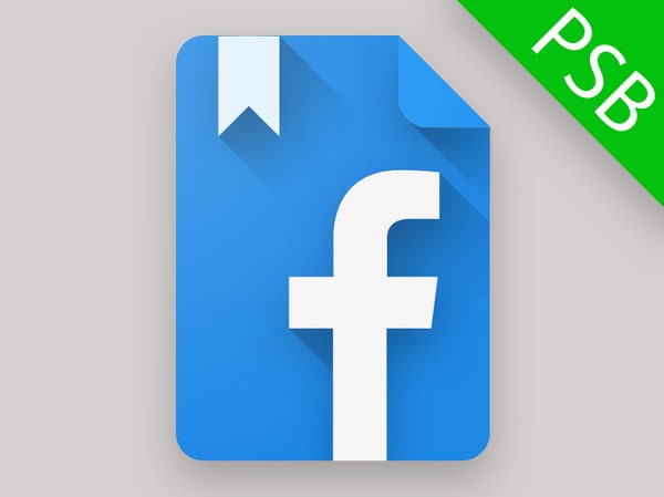
Material Facebook by Giulio “bart172” Smedile
The designer improves a classic Facebook icon with a face-lift by implementing material guidelines. As a result, the symbol breathes with freshness and crispness. Download the freebie and explore it more thoroughly.
Icons by Drawithpixels
The author displays a part of a project where icons benefit user experience. Each item is a clever visualization of a section. Not only do they brighten up the UI but they also make it more instinctive.
Periodic Table Product Icon by Michael Cook
Periodic Table Product Icon by Michael Cook is a part of an ambitious project that comprises a dozen of professionally created icons. We feature the glyph that illustrates periodic table; there are also “popcorn time,” “slide for Reddit” and some others. All of them have a sophisticated and original appearance based on a garish coloring.
Material Design Harry by Hannah Atkin
Material Design Harry by Hannah Atkin has a view of a traditional iOS app icon with a sense of compositional harmony and a touch of playfulness. It includes plenty of details, yet remains balanced and tidy.
Material Design Icon Templates by Zlatko Najdenovski
This is another freebie that is aimed to streamline the process of creating an appropriate product icon or system icon. It is available in AI format and has guides and general shapes that unobtrusively make you stay within the frame.


