01. Define what success means

Before starting the work you need to know what is it you are designing for. Besides the description of the site, you need to know what the expectations are for it. Take a news site for example, what’s the goal? Is it to make make as many ad impressions as possible or is it to provide the best reading experience? How are those goals going to be measured?
Good redesigns are not necessarily the most flashy ones but the ones that improve performance over time. Talking to your clients before starting your design is key to define all of this. You need to learn what their concerns and goals beyond the written SOW (statement of work) are.
02. Put your thoughts on paper first
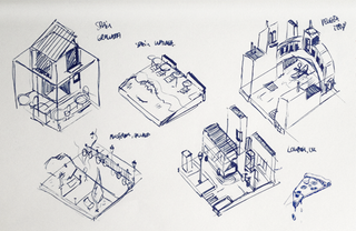
This seems very obvious but I’ve found too often that designers jump straight into their work before giving any thought to the problem they are trying to solve. Design is about solving problems, and those problems can’t be resolved through gradients or shadows but rather through a good layout and a clear hierarchy.
Think about the content, the layout and the functionality before starting to drop shadows. Make sure those thoughts are in line with your client’s goals and feel free to share them. No client ever has complained to me about over-communicating ideas.
03. Start sketching a top-level framework
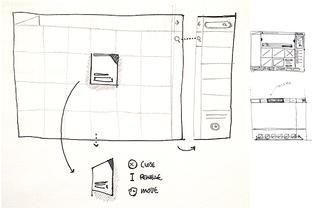
When I’m asked to create a look and feel for a project, the first thing I do is to come up with a top-level framework that solves all the design problems. The framework is the UI that surrounds the content and helps the user perform actions and navigate through it. It includes the navigation and components like sidebars and bottom bars.
If you approach your design from this perspective, you will have a clear understanding of what your layout needs will be when designing sections beyond the homepage.
04. Add a grid
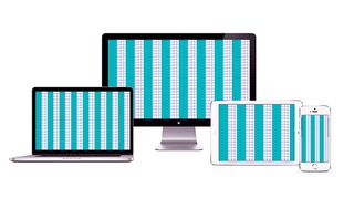
It’s as simple as it sounds. Before starting to design anything you need a proper grid. There are no valid excuses for starting without a grid – and if you don’t, I can assure you, the design won’t look as good. A grid will help you to structure the layout of the different sections; it will guide you through the specific screen size requirements, and help you to create responsive templates, so you’re consistent in terms of spacing as well as many other design issues.
To find out how to do this, take a look at this guide to creating a grid that adapts to all screen sizes.
05. Choose your typography
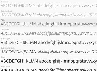
Exploring different typefaces and colours is part of the discovery phase of a project. I would recommend not using more than two different typefaces in a website, but it really depends on its nature. Overall, choose a font that is easy to read for big chunks of text, and be more playful with titles and calls to action. Don’t be afraid of using big fonts and be creative and consistent when using typography.
06. Select your colour theme
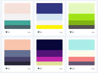
It’s important to apply those consistently across the UI depending on the element’s functionality. Think about the layout of sites like Facebook, Twitter, Quora and Vimeo. Besides the UI there shouldn’t be any colour restriction for illustrations or graphic details, as long as they don’t interfere with the functionality of the components.
If you get stuck, take a look at our list of free apps for picking a colour scheme.
07. Divide the layout

In reality there shouldn’t be too many calls to action on a page – everything should drive to that final ‘What can I do here?’ Think about the most simple layout you can imagine for a simple purpose and start adding components that are necessary. In the end you’ll be surprised how hard is to keep it simple.
08. Rethink the established

Do we really need a search button any more? In most cases the answer is no. As designers we shape the way users browse the internet, it’s up to us to decide how many steps a simple action will take and how efficient our site will be.
Some conventions are there because they work, but some are there because no one spent enough time evaluating them. It’s important to rethink the established interactive patterns of all components to see how we can improve them.
09. Think in motion
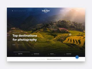
Motion is essential when designing interactive experiences. No design can be judged on its own or as a static comp any more; every component is defined by its relationship with the system, and that relationship needs motion to be conveyed properly. Motion can illustrate dynamic effects on content or interactive states within your layout. For that second purpose I recommend taking your designs a bit further into prototyping.
10. Prototype, prototype, prototype
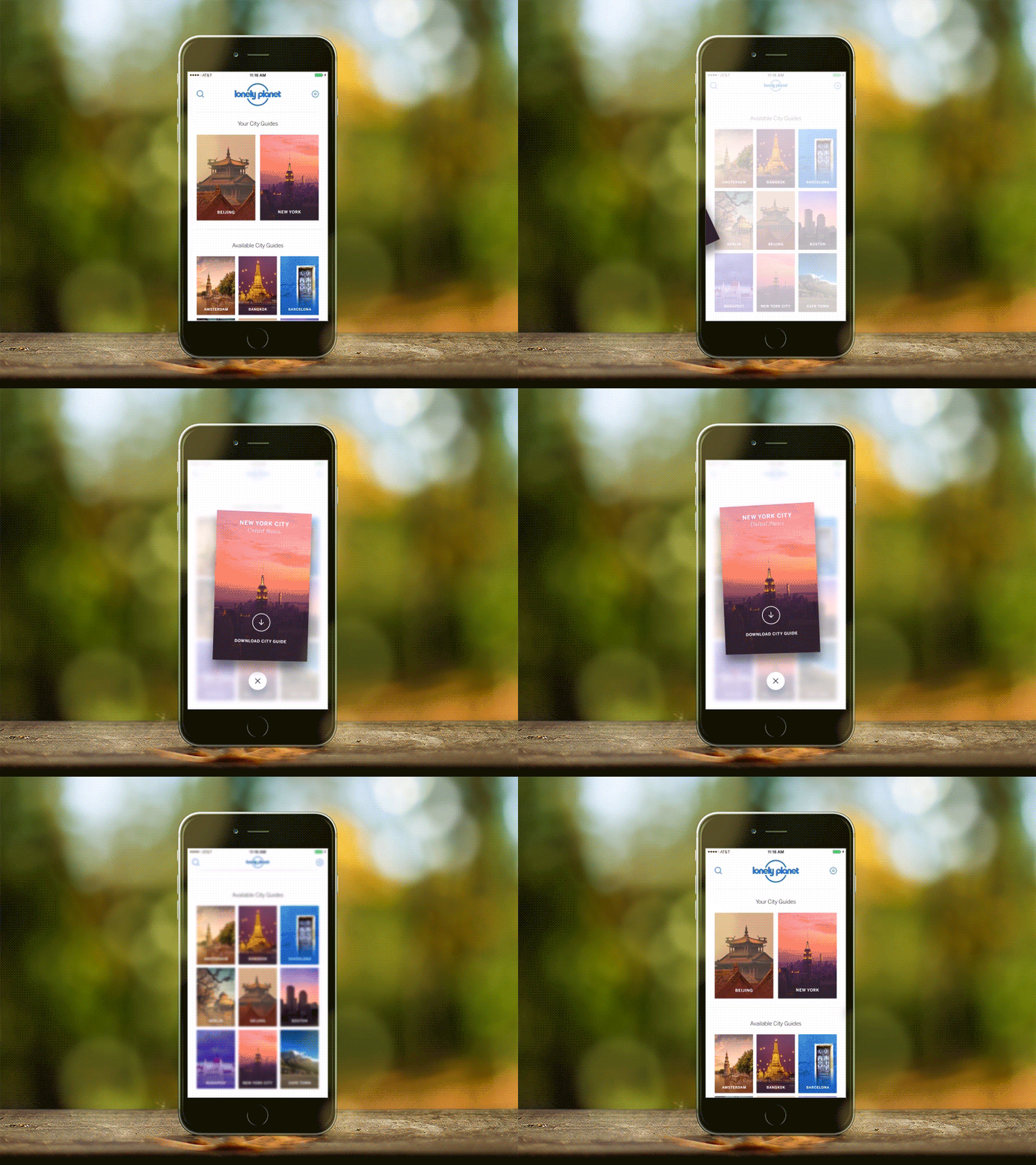
Prototyping is the best way to test interactions and technology. There are lots of prototyping tools that make it easy nowadays, and you don’t need to be a coding guru to create effective prototypes. This is yet another way you can get your client excited and on board with concepts and ideas that would otherwise need a lot of explanation.
11. Challenge yourself
I encourage every designer out there to challenge themselves on every project. Innovation isn’t always a requirement for the project, so it’s up to us to come up with something fresh. Examples of different challenges could include using a new grid system, creating a new component, or even minor challenges like avoiding blend modes or using a specific colour.
12. Pay attention to the details

This statement has been overused lately but it’s not always visible in the final product. Depending on the concept behind the project, that ‘attention to detail’ can mean different things.
It could be a small interaction, an unexpected animation or an aesthetic touch like a little gradient in a button or a subtle stroke around a box in the background. But overall this touch is essential – and it will come naturally if you really enjoy what you do.


