


divelements. Argh, ugly. Well, not any longer. Now, with simple CSS, you can lavish your designs with more curves than Marilyn Monroe.
Border radius?
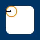
Yeah. Border radius. Fear not, though — you don’t have to have borders. The border-radius property can be used to add a corner to each corner of a box.
#marilyn {
    background: #fff;
    width: 100px;
    height: 100px;
    border-radius: 20px;
}
And there you have it. Rounded corners, see? Well, you will if you’ve got a sensible browser (see note below).
Of course, if you do want a border…
#ok_a_border_then {
    border: 5px solid #8b2;
    width: 100px;
    height: 100px;
    border-radius: 5px;
}
Multiple values
border-top-left-radius, border-top-right-radius, border-bottom-right-radius, and border-bottom-left-radius can also be used to target specific corners.
Ever so slightly less horribly wordy, you can also define all corner radii (what a great word) individually with a space-separated list of values, working clockwise from top-left, just like other shorthand properties:
#monroe {
    background: #fff;
    width: 100px;
    height: 100px;
    border-radius: 6px 12px 18px 24px;
}

By using two values instead of four you target top-left and bottom-right with the first length (or percentage) and top-right + bottom-left with the second. Three values? Top-left, then top-right + bottom-left, then bottom-right. Smashing.
Ellipses
Are circles a bit too square for you? You can specify different horizontal and vertical radiiii by splitting values with a “/”.
#nanoo {
        background: #fff;
        width: 100px;
        height: 150px;
        border-radius: 50px/100px;
        border-bottom-left-radius: 50px;
        border-bottom-right-radius: 50px;
}


