Social Design Principles
Although pure social networks were the original contemporary social applications, many of their design principles apply to designing social patterns for any kind of mobile application. Smashing Magazine detailed some of the most important best practices in Social Network Design: Examples and Best Practices and I’ve adapted that list below:
- Engage quickly
- Show profile photos (i.e. an identity)
- Make it easy to self-express
- Make it easy to take action
- Allow users to connect with each other
- Make it easy to communicate with others
- Allow contacts to be grouped
- Show only relevant information
- Make content dynamic
An Overview of The Patterns
Keeping in mind the design objectives above, here’s an overview of the design patterns we’ve detailed in this article and at even greater length in our e-book, Mobile UI Design Patterns 2014:
- Activity Feeds
- Friend Lists
- Follow
- Vote to Promote
- Direct Messaging
- Single Share Button
- Like
- Find & Invite Friends
1. Activity Feeds
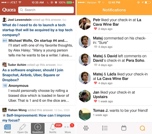
Quora, Swarm
Problem
The user wants to keep up with what’s happening around them and get quick updates on recent activity.
Solution
Show recent activity that’s relevant to the user within the app. Aside from the obvious Facebook or Twitter news feeds, other apps that contain an element of social interaction, like Quora or Swarm have implemented activity feeds that provide users with an overview of recent activity from their friends or people they follow. The activity stream can be used to aggregate recent actions by an individual user, commonly used on profile pages; more commonly however, activity feeds are used to aggregate multiple users from the perspective of one user. These feeds are extremely useful in demonstrating different features of the UI by showing how other users are interacting with it, and in this also plays a great word-of-mouth role.
Quora and Venmo are two of my favorite activity feeds because “learning” and “earning” are two of the primary things people do in life. It’s fascinating to passively see people I know provide meaningful answers about self-improvement while others are spending their hard-earned money on pixels and lip rings.
2. Friend Lists
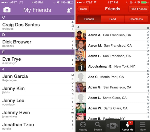
Snapchat, Songkick
Problem
The user wants to keep track of their friends and contacts within the app.
Solution
Show all the user’s connections or friends in a list. Snapchat and Yelp are part of the growing number of apps that give you friend lists. Whether it’s one-on-one communication or keeping track of someone’s tastes and preferences, the way users explore their blossoming friend groups will become increasingly contextual, requiring friends to become a more integral part of the web and mobile experience.
3. Follow
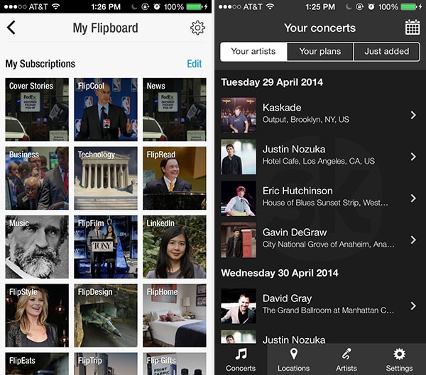
Flipboard, Songkick
Problem
The user wants to track and keep up to date with activity on topics or themes, not just people.
Solution
Let users select items that they want to stay up to date with. Aside from the purely social apps like Twitter, other apps like Circa, Playboard, Flipboard and Songkick let you select channels or artists that you want to keep track of, and updates are shown in the user’s newsfeed. Whether you have friends or not, there’s endless user-generated content to keep you busy. For the same reason friend lists will become an increasingly important UI design pattern, so will following.
4. Vote to Promote
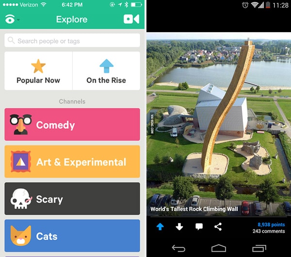
Vine, 9Gag
Problem
The user wants to endorse and share content they like.
Solution
Let users participate in content curation by designing a voting system, where content they like can be promoted. The idea of crowd-sourced content curation was popularized by the likes of Digg and Reddit, and today we see almost every app that has user generated content integrate this pattern to bring up the best.
5. Direct Messaging
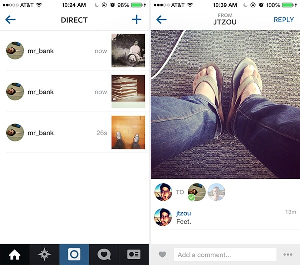
Problem
The user wants to send private messages to their friends from within the system.
Solution
Allow users to interact with each other in private messages alongside their other interactions. Carousel and Instagram and many other apps offer chat or direct messaging as an integral part of their experience. Private chat UI design patterns will continue to blossom across many apps, not just traditional “social networks” now that users are finally comfortable sharing more private things online and they have substantial breadth in the content they’re generating online, even their financial transactions on apps like Venmo.
6. Single Share Button
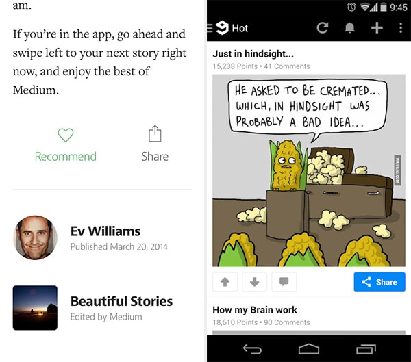
Medium, 9Gag
Problem
The user wants an easy way to share interesting content via various channels.
Solution
Provide an easily accessible share feature that can be accessed through a button (or gesture). Because of the limited space on mobile UIs, most apps consolidate this into a single button instead of showing all the options up front. Medium, like many other apps, has consolidated the ugly “share” widgets with a single share button to give you a beautiful experience as well as a clear action to share the content, regardless of where you want to share it. The UI can integrate with the platform to provide greater flexibility to the user, for example iOS integrations with Facebook and Twitter and the Android share actions which allow transferring content through to any other app installed on the system.
7. Like
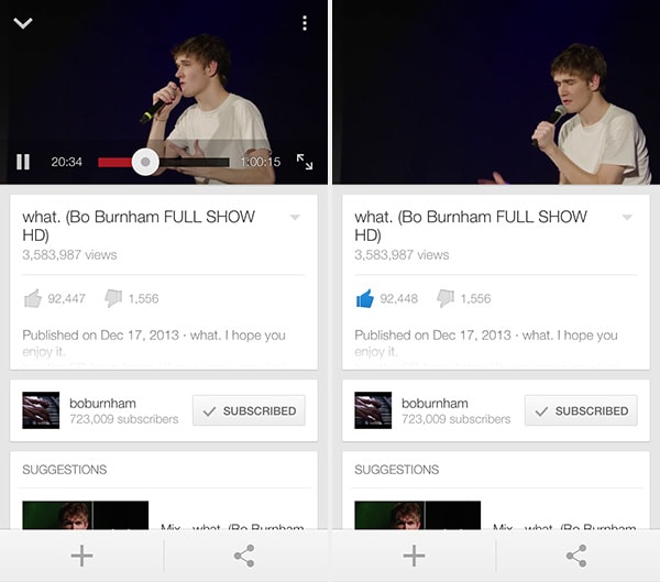
YouTube
Problem
The user wants to rate content in a simple way without having to worry about the degrees to which they like it.
Solution
Simplify rating controls by making them binary choices – the user either likes it or dislikes it. Eliminating the fine-grain of stars and rating scores, this makes rating things easier for users as well as interpreting them. If I liked a video, should I rate it 4 stars or go all the way with 5 stars? YouTube and almost every application lets you like (or even dislike) everything in a binary wayinstead. A lot of apps provide a way of showing appreciation by simply “liking” or “hearting” content
8. Find & Invite Friends
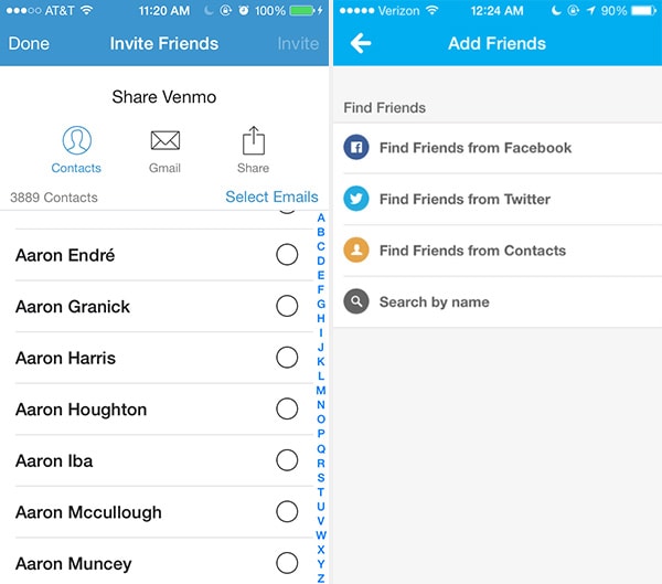
Venmo, Foursquare
Problem
The user wants to experience the application with their friends.
Solution
Make the invitation process simple and easy to complete. Venmo, for example, makes it really easy to invite others through social, mobile contacts, and email integrations. Since word-of-mouth and referrals are a huge driver of growth especially in consumer applications, you’ll see this UI design pattern proliferate and evolve even more. The invite feature can be built into the onboarding pattern or even as the empty state design, both of which we’ve covered earlier.


